
Sunny (Health) Benefits
Sunny Benefits is a user-friendly platform that helps users access, manage, and maximize their public healthcare and financial benefits, such as Medicaid, SNAP, and other social services. The app provides a personalized dashboard, educational content, and alerts to help users stay informed and avoid lapses in coverage. It simplifies the complexity of navigating benefits systems, especially for families and individuals with limited time or digital literacy.
Company
Sunny Benefits
Role
Senior UX/UI Designer
Timeline
05/2025 - 07/2025
As theUX/UI Designer at Sunny Benefits, I helped to lead key enhancements across the native and web app experience for our health benefits membership product. Partnering closely with the Product Design Lead, cross-functional Dev Teams, and the broader Design Practice, I identified and addressed usability pain points through targeted UX audits, design explorations, and interface refinements. My work included the integration of new UI components and interaction patterns into the existing design system—elevating visual consistency while improving user flow clarity and accessibility. All updates adhered to brand standards and contributed to a more cohesive, intuitive, and user-centered product experience across platforms.
My Role.
Deliverables
Hi-Fidelity Mockups
Interactive Prototypes
Design System Components
Design Tools
Figma
Adobe CC
Productivity Tools
Office 365
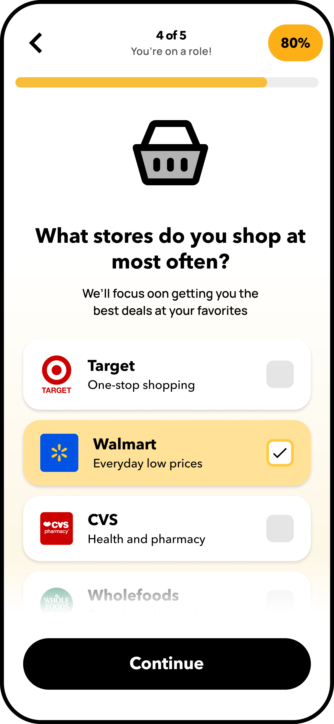
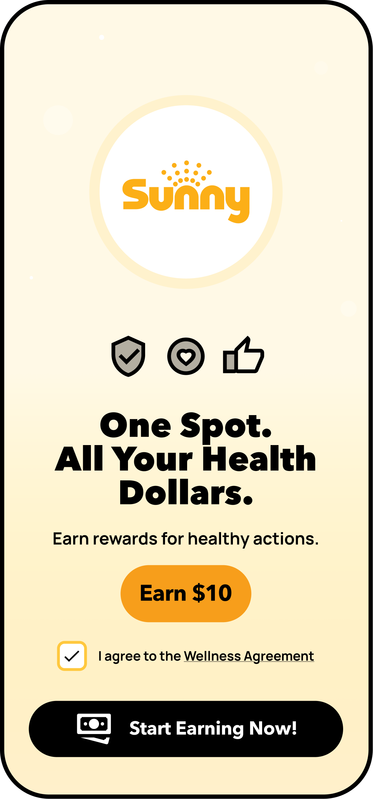
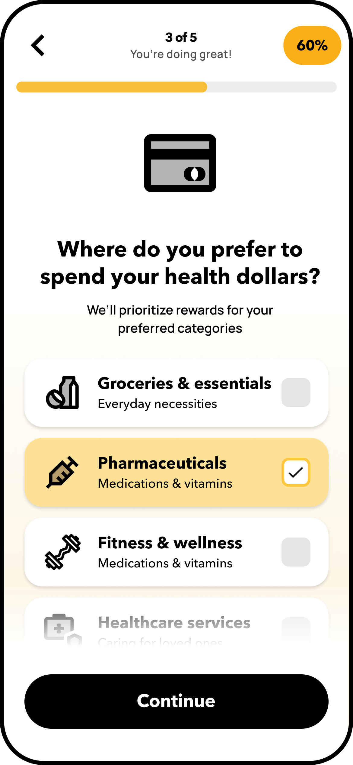
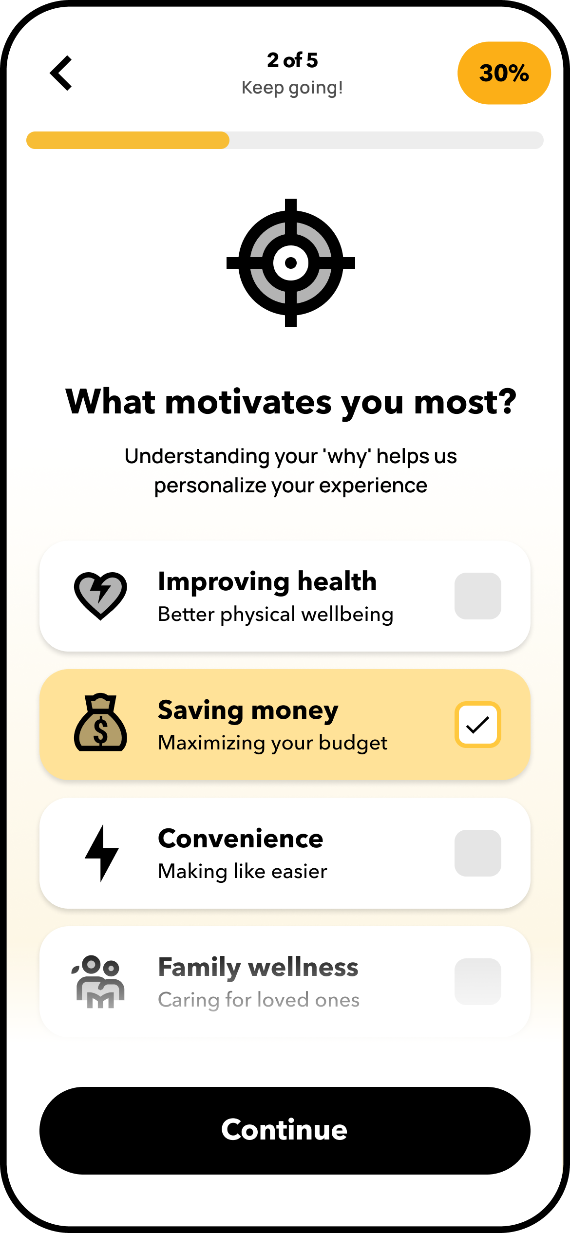
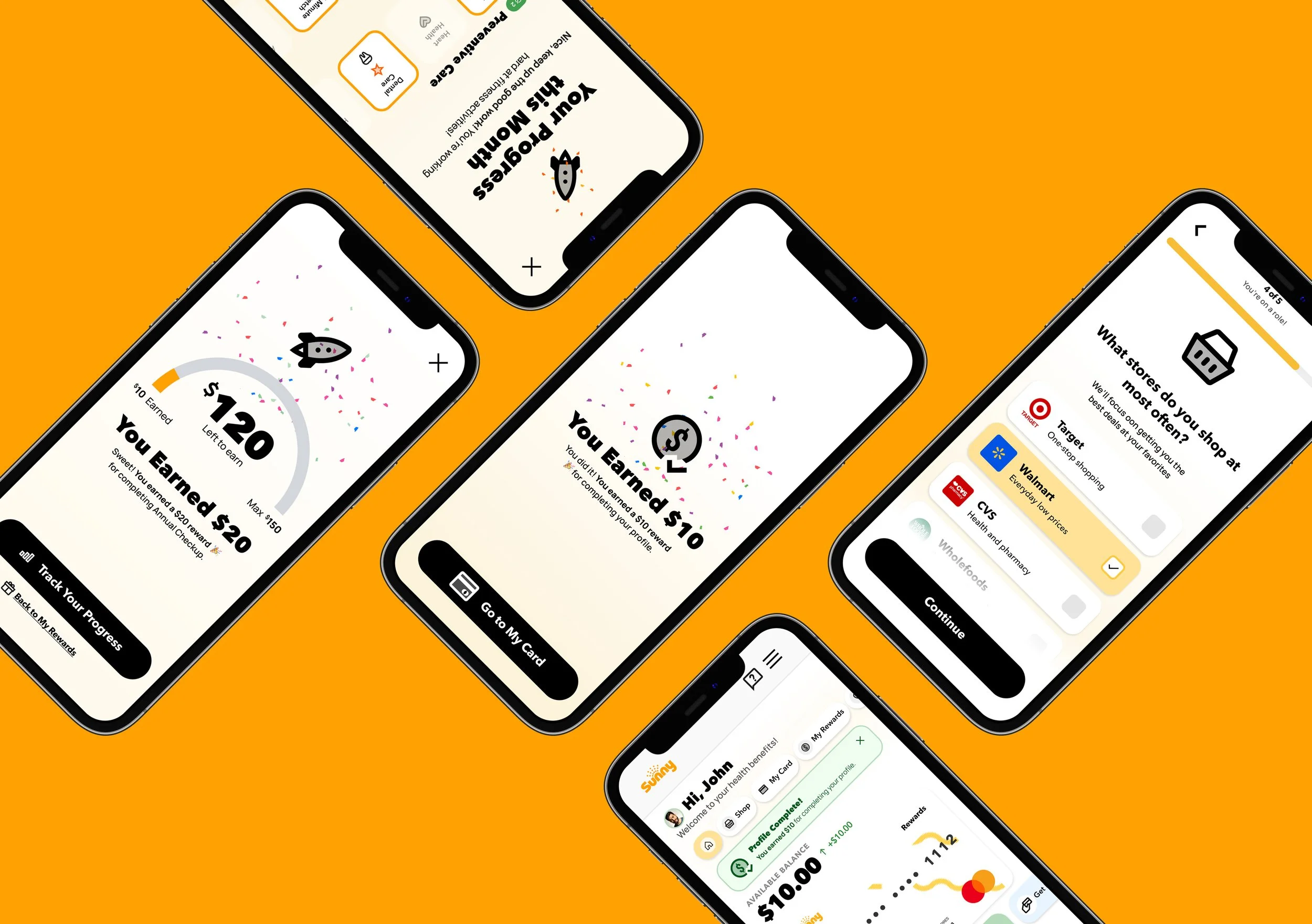
User Signup Profile Survey
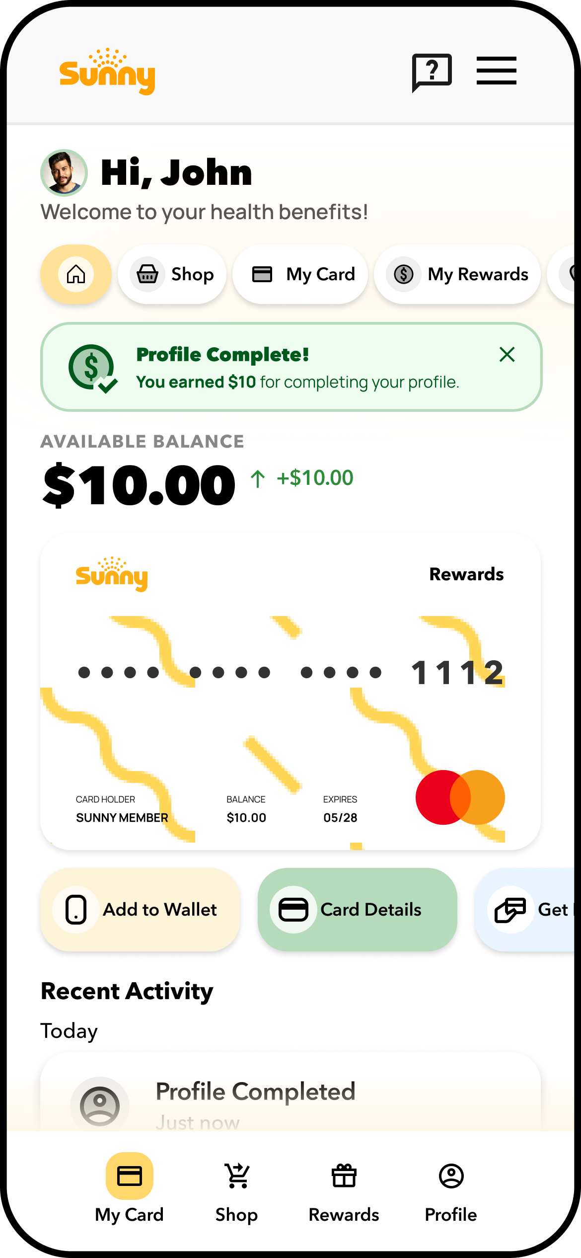
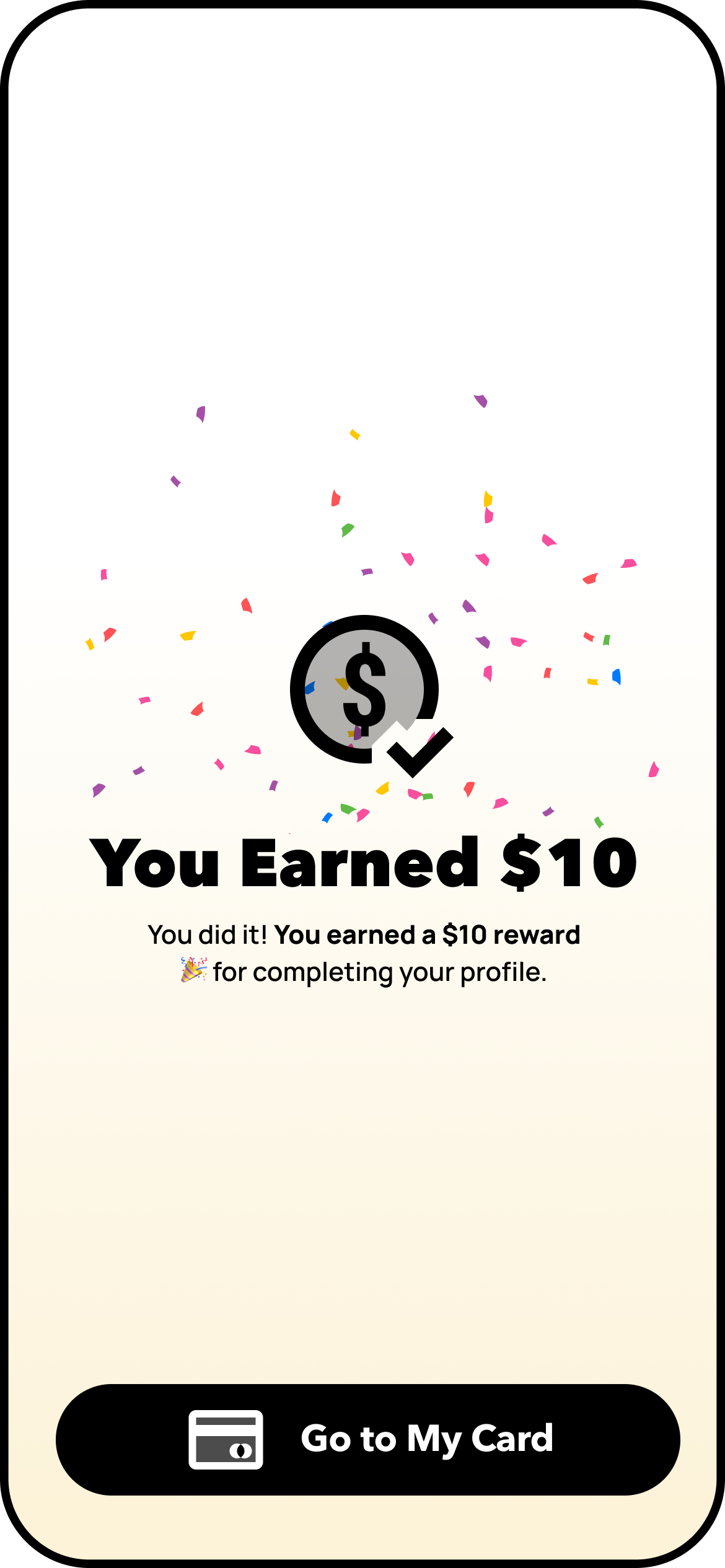
This experience redesign tackled friction at first touchpoints by streamlining onboarding, introducing personalization, and modernizing access to significantly reduced user drop-off. Key UX upgrades included a simplified onboarding flow using checkbox-based terms, an incentive-driven preferences survey, and smart sorting for rewards and tasks.
Personalization was introduced early to increase relevance, trust, and user investment, while the addition of a mobile-first digital card aligned with user expectations for Apple/Google Wallet compatibility.


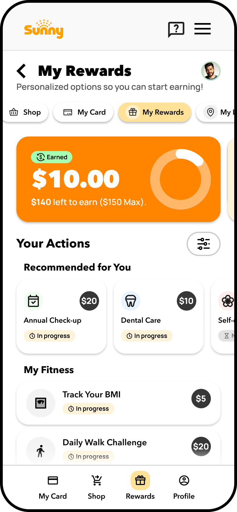
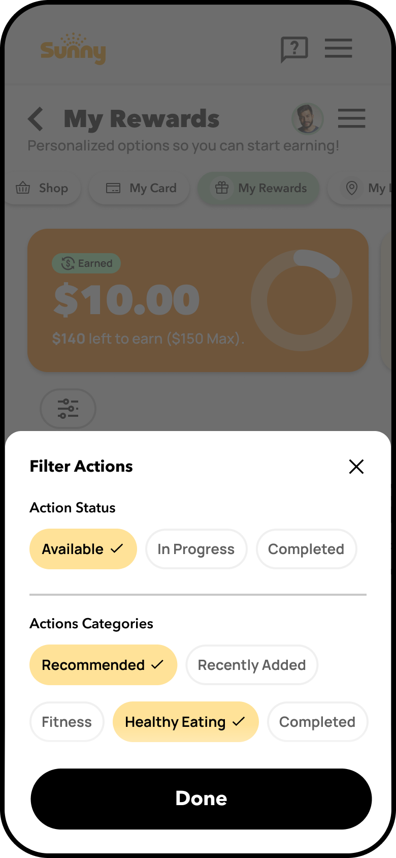
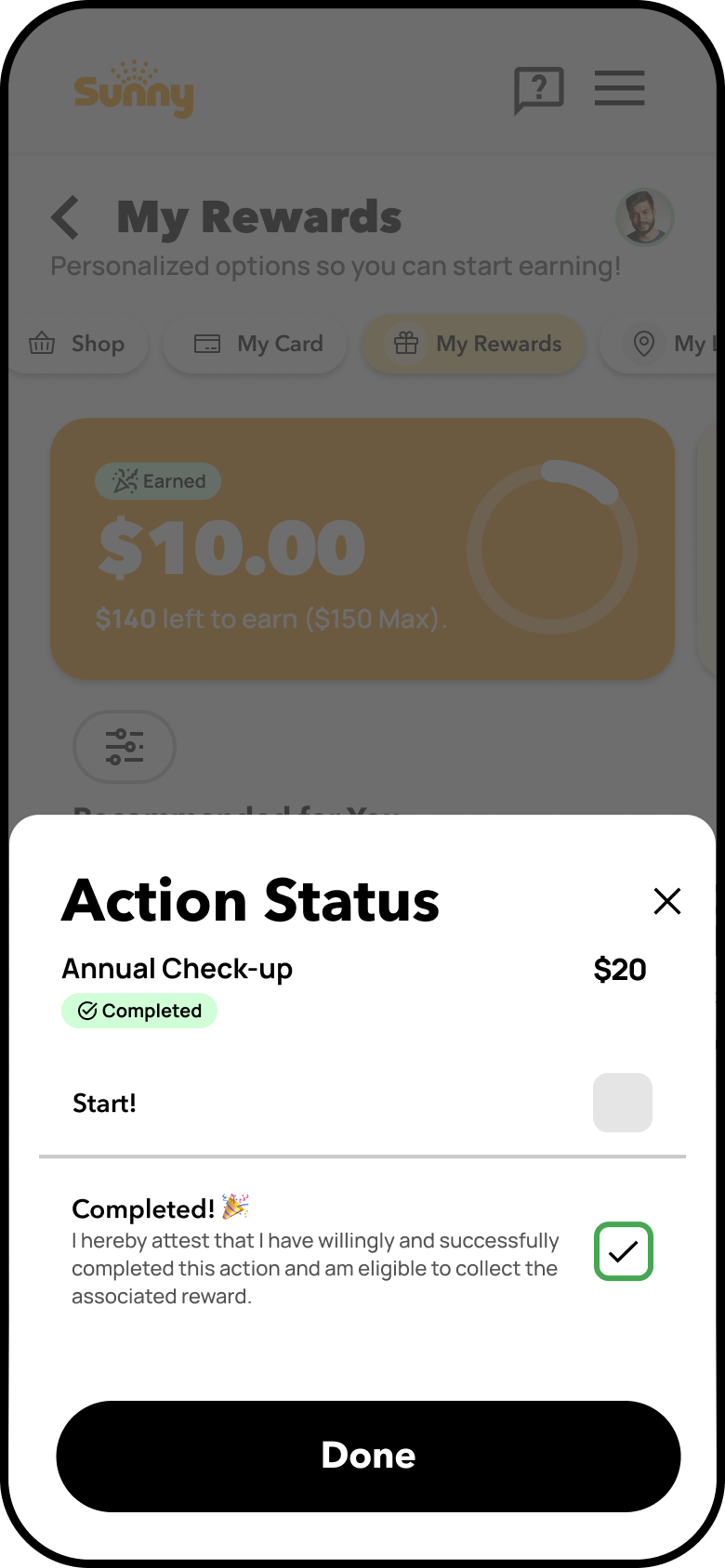
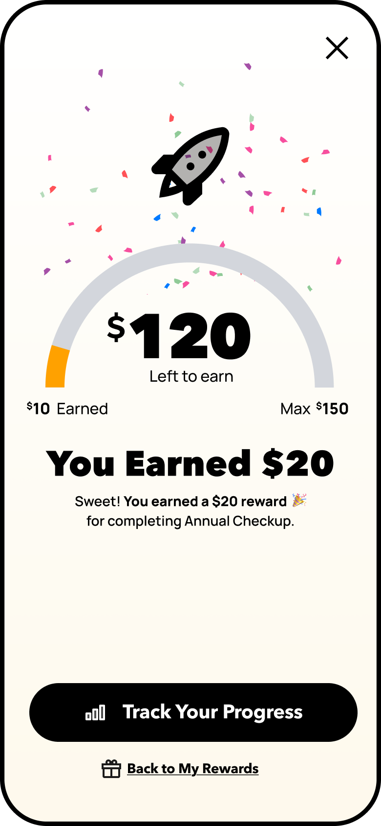
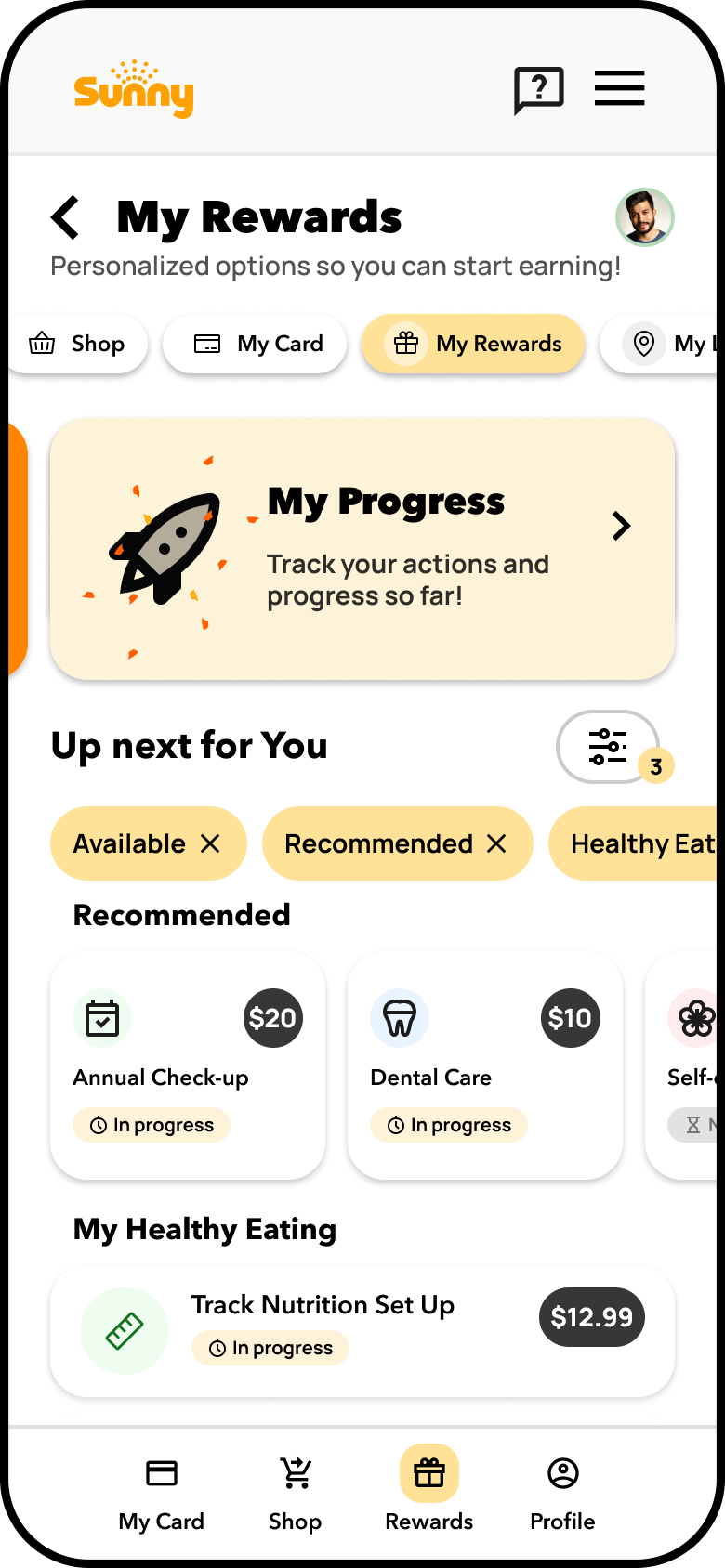
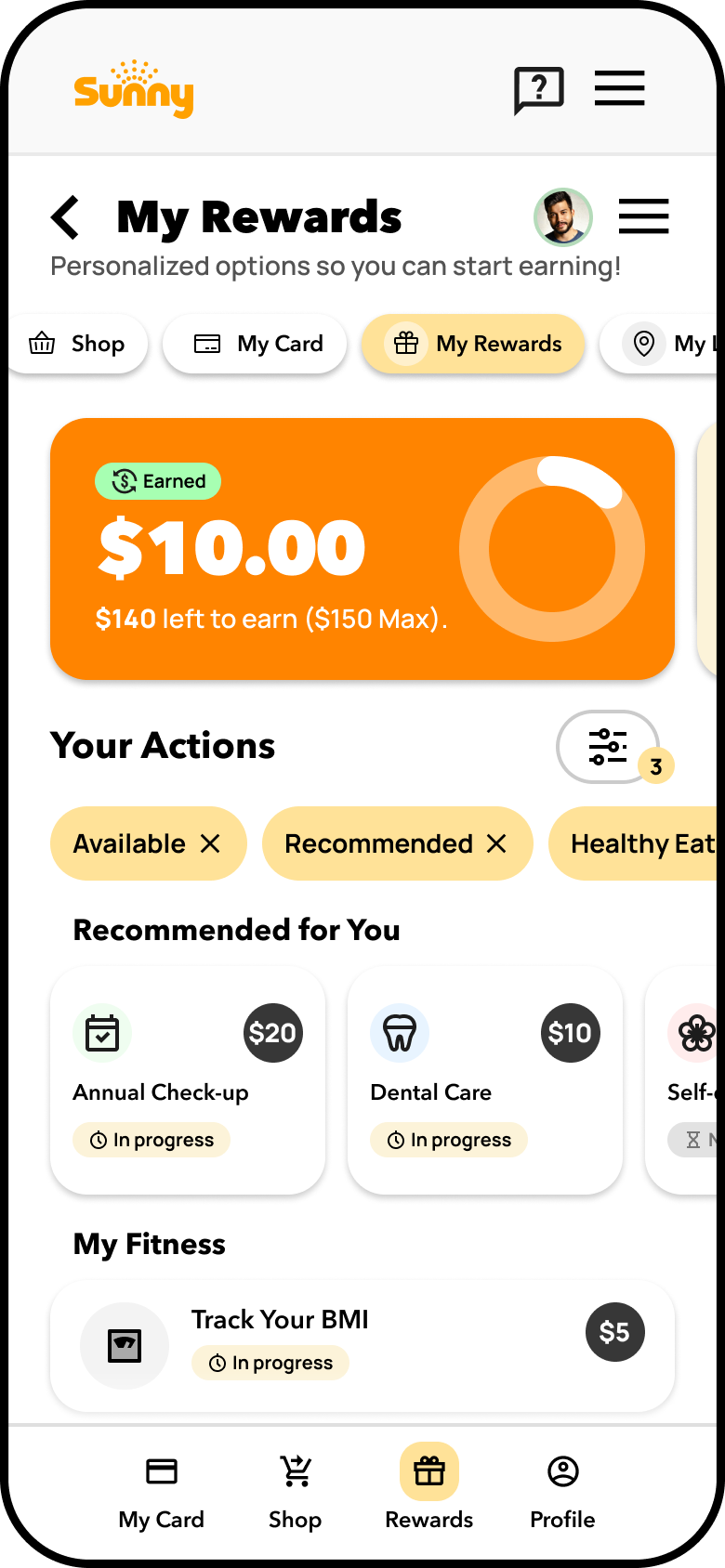
My Rewards Preferences
Designed to deepen user engagement with Sunny’s reward system, this personalized dashboard tailors reward actions based on user survey inputs and past activity.
Users are greeted with relevant action tiles (e.g., “Annual Checkup,” “Dental Cleaning”) and smart call-to-actions like “Already done this? The layout preserves vertical card stacking with filters persistently accessible, supporting fast discovery and reward tracking.
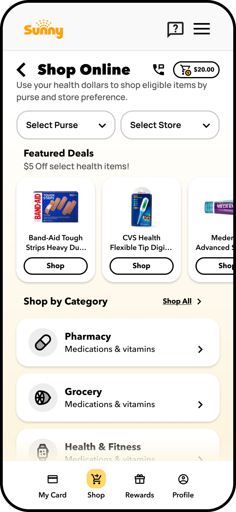
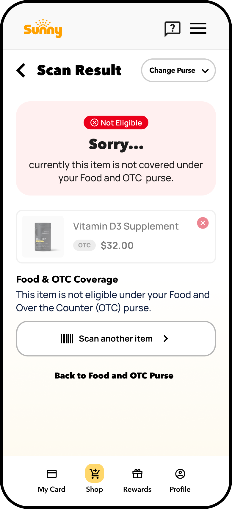
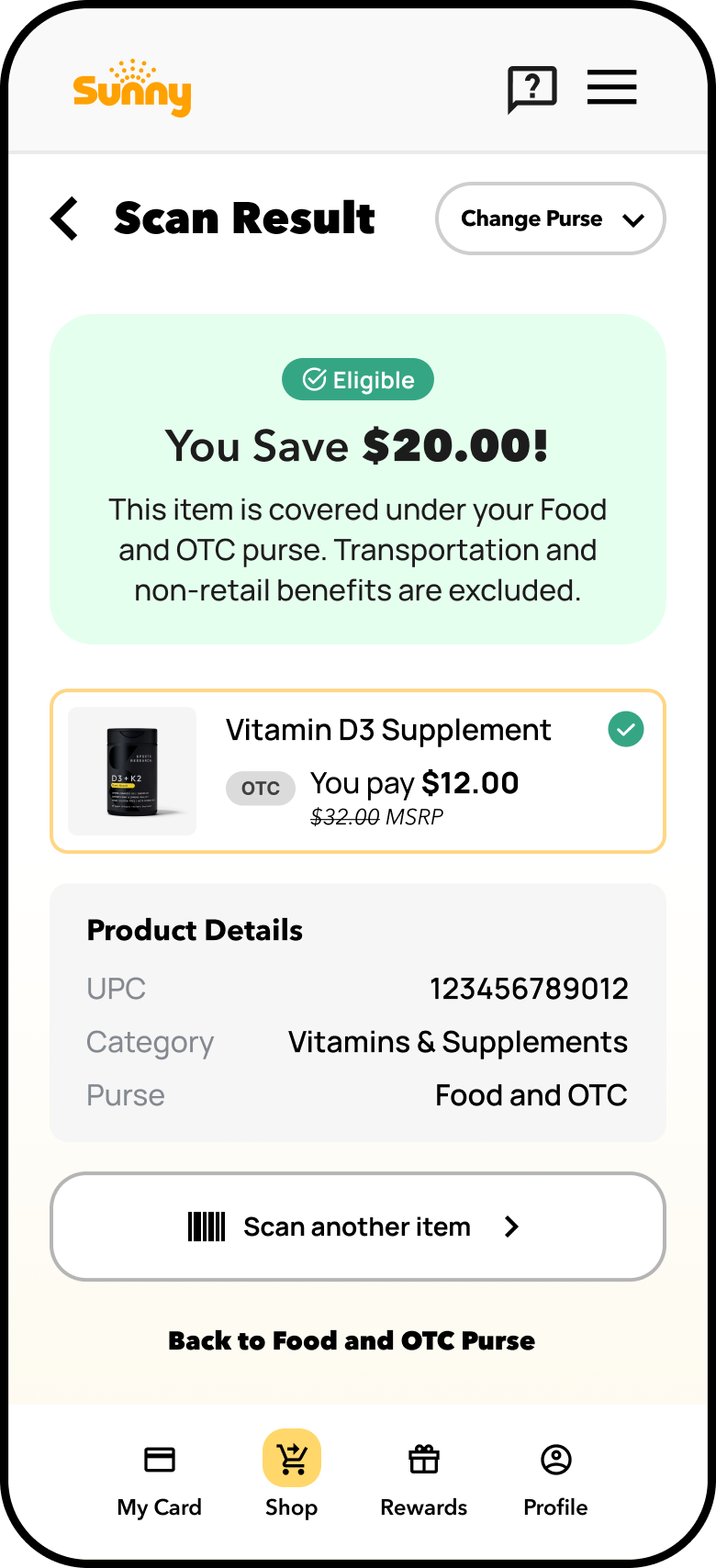
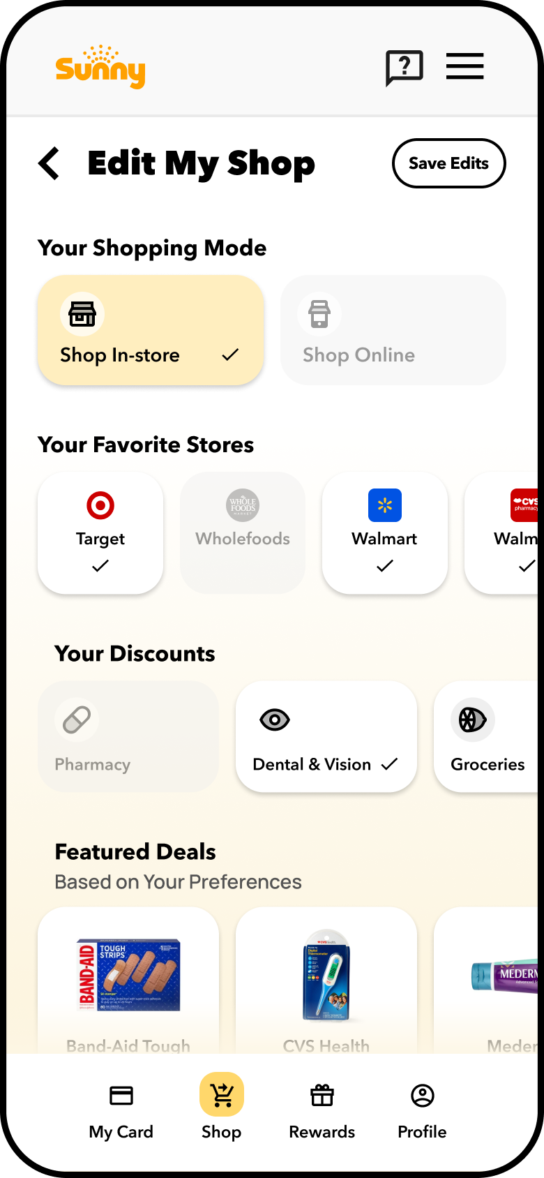
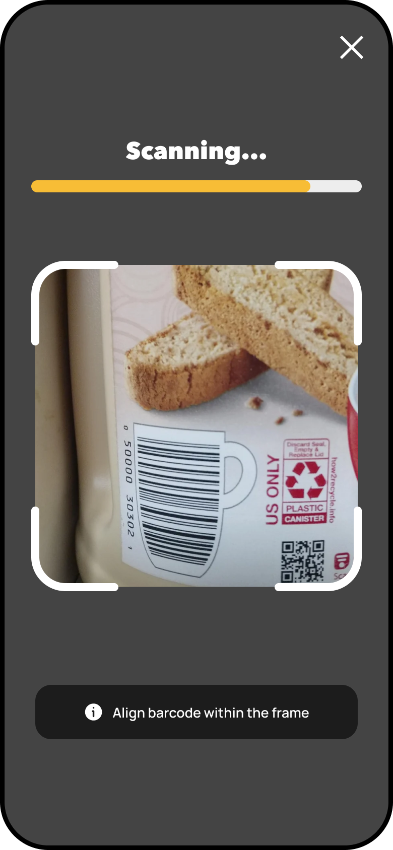
Shop Entry + In-store Benefits Checker
To address confusion across the shopping experience, this redesign brought clarity to both in-store and online health benefit use. Users were previously overwhelmed by generic, text-heavy interfaces and a lack of visibility into eligible products and retailers. The solution included personalized shop preferences, smart filtering by benefit type or retailer, and a UPC Scanner feature to improve store-level discovery.
These enhancements foster a more intuitive, guided experience that boosted confidence and helped users maximize their health dollars both online and in stores.
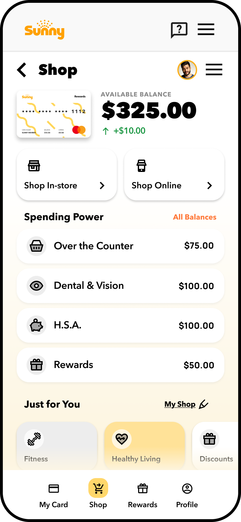
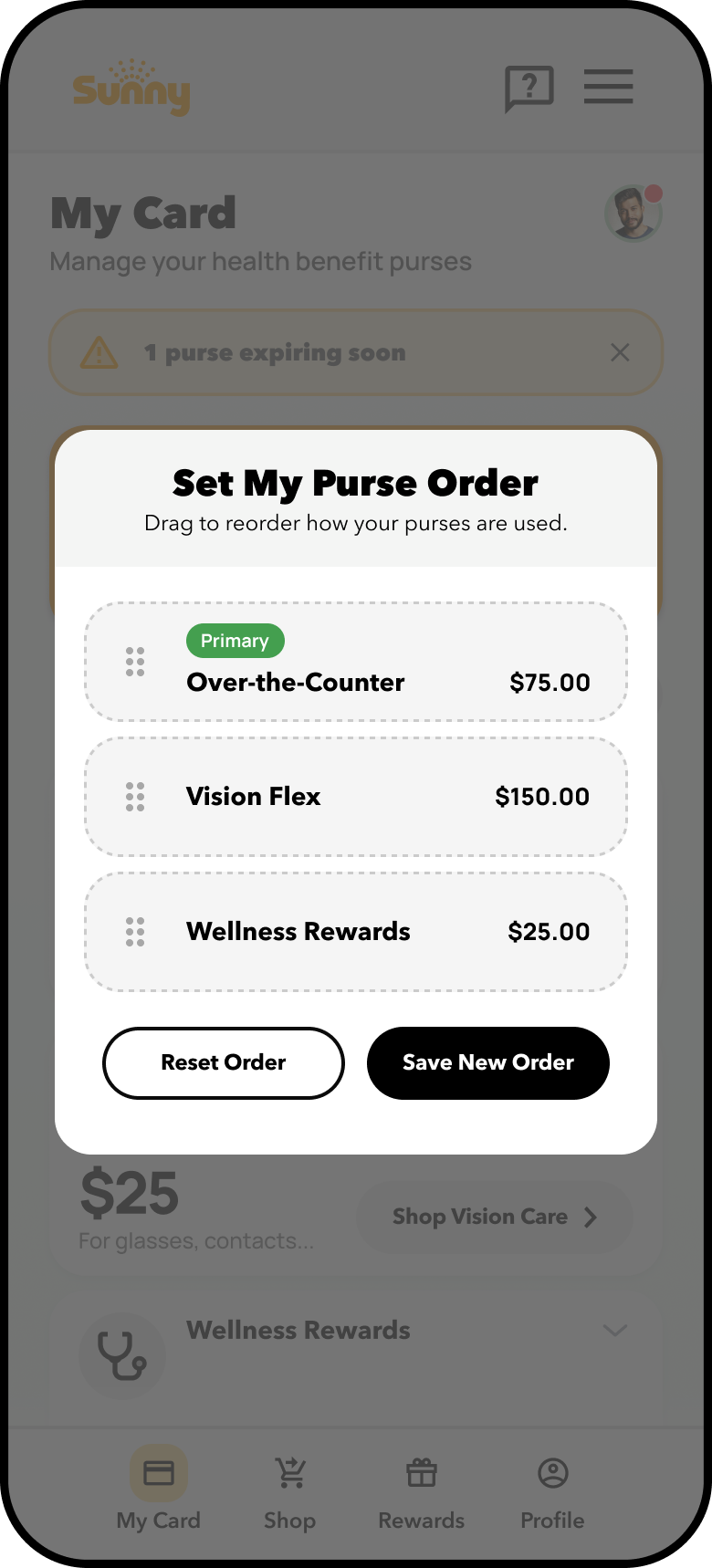
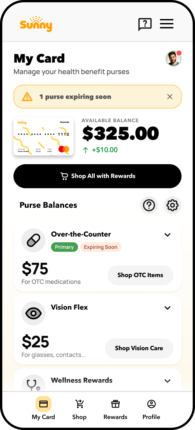
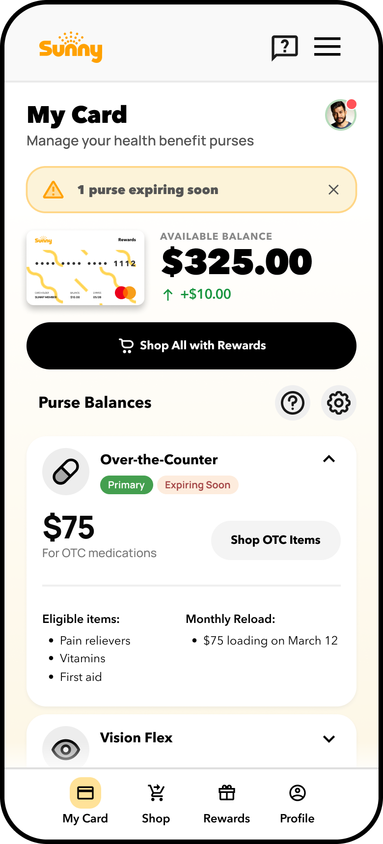
My Purse Status Indicators
The My Purse Status Indicator system introduces intuitive visual tags that help users quickly understand the state and priority of each health benefit purse. A green “Primary” badge identifies the default purse used for eligible purchases, while an “Expiring Soon” label alerts users to balances that will expire shortly—encouraging timely usage to avoid loss. Inactive or depleted purses are visually de-emphasized or hidden until reactivated, reducing interface clutter. These real-time status cues enhance clarity, guide purchase behavior, and support better benefit utilization across all user types.
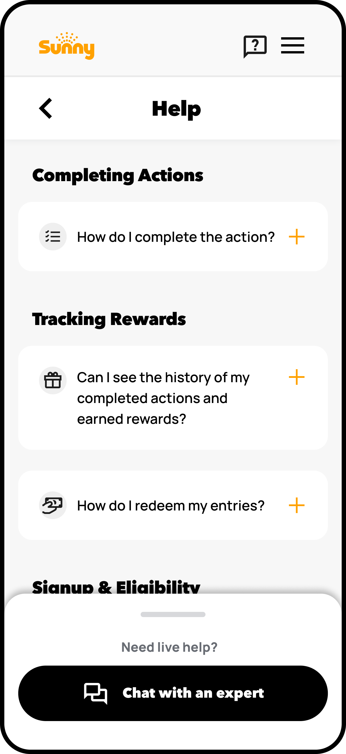
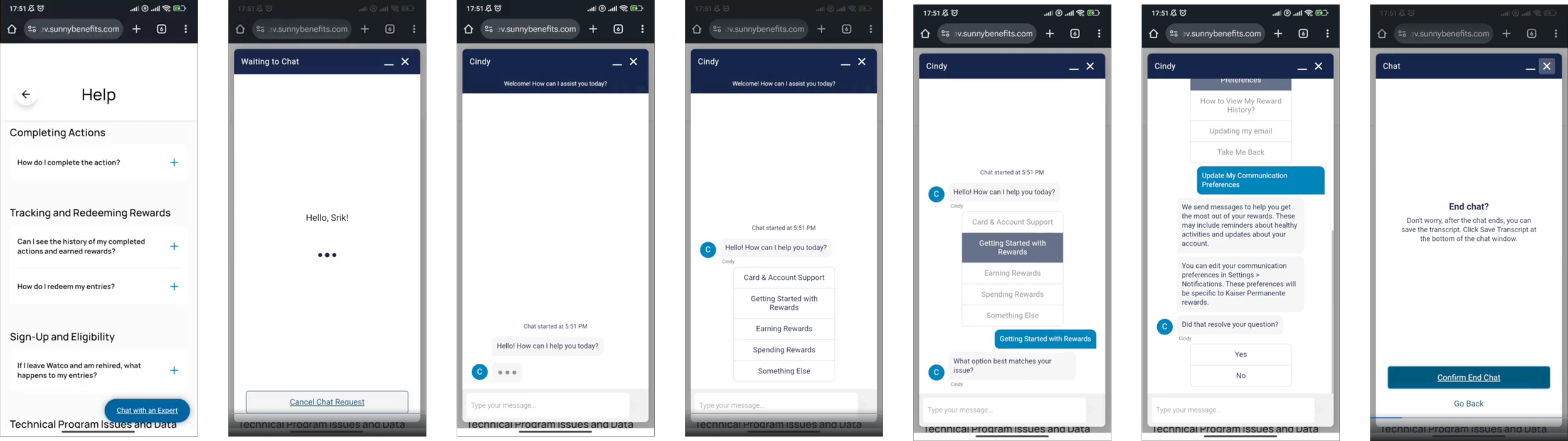
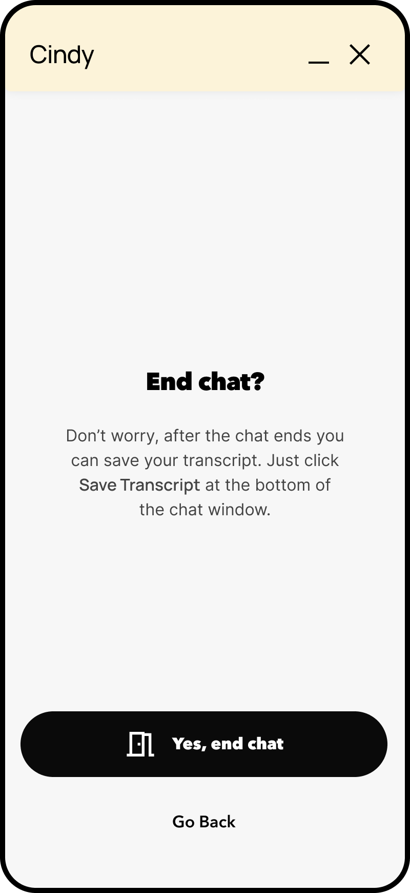
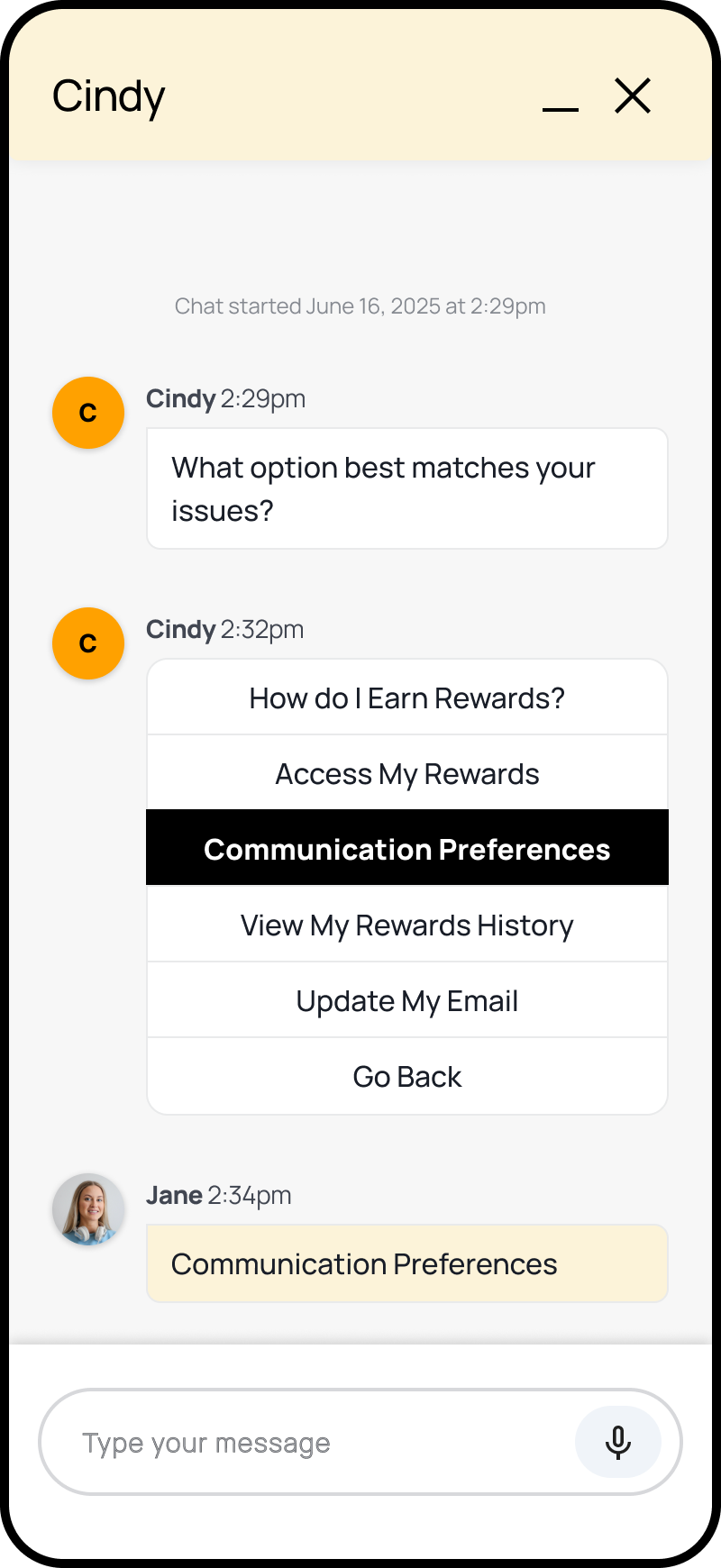
Chatbot Support Improvements
Focus on improving discoverability and interaction within Salesforce’s strict SDK limitations. The solution applied mobile-first design best practices: annotated wireframes introduced floating chat launchers, redesigned input areas with supported quick replies, and message alignment optimizations for small screens - enabling accessible, responsive, and compliant support experiences that increased engagement and user satisfaction across mobile web sessions.
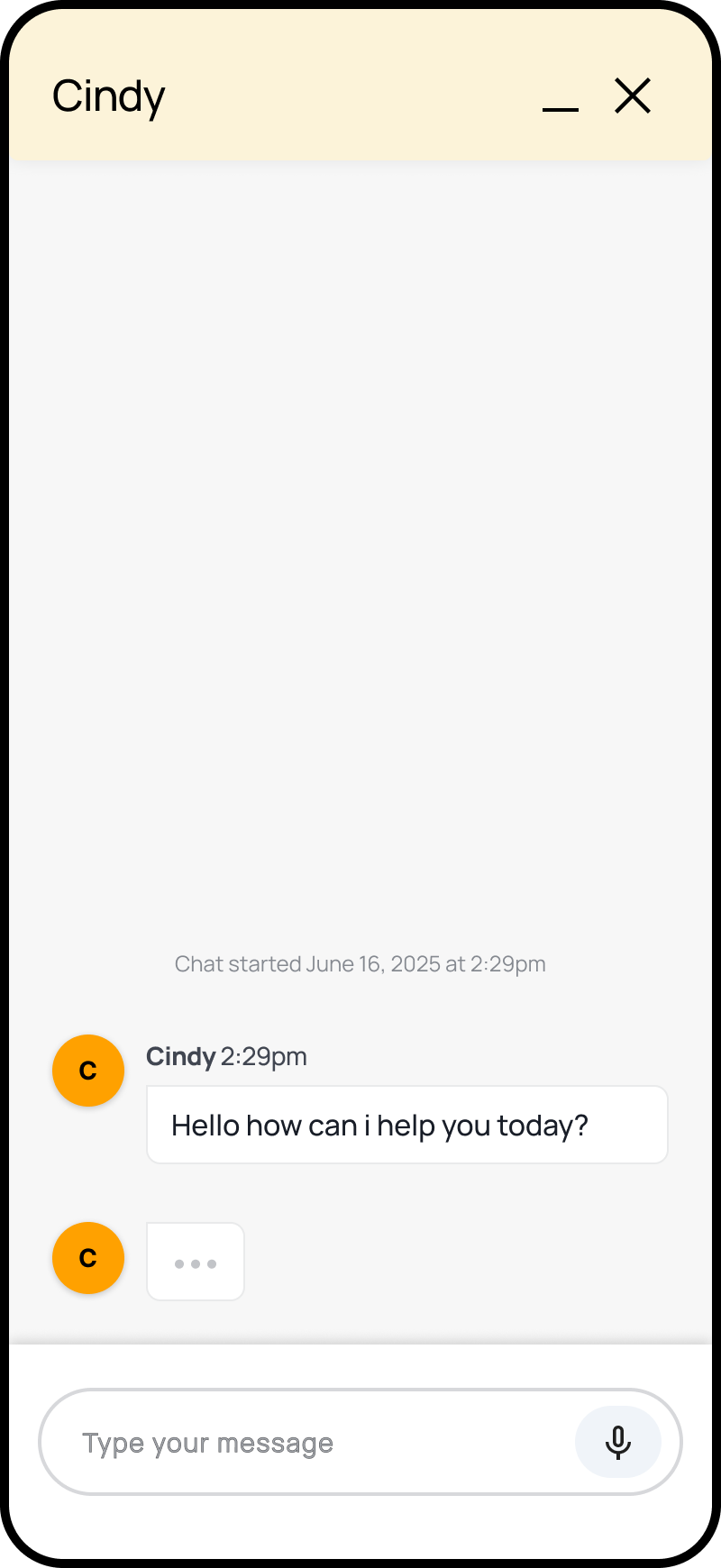
Current-state Experience
Users struggled to find the chat entry point and use quick actions due to cramped layouts and unclear icons.
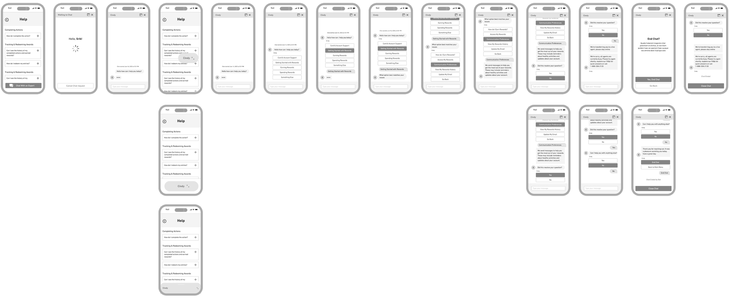
Low-fidelity Wireframes
Low-fidelity wireframe explorations and mockups - examining key aspects of chatbot flow.
End.
The completed deliverables were phased & prepped for hand-off to the Development Team for build-out and for use in phased usability testing, which was the next stage of the project.