
meQ
meQ is an enterprise wellbeing platform designed to assess, support, and improve employee mental health through personalized onboarding, skills, activities, and learning content across web and native mobile experiences.
Company
Mequilibrium
Role
Sr Digital Product Designer
Timeline
03/2023 - 10/2023


The meQ mental well-being native and web app require UX/UI enhancements to address identified pain points and improve the user experience. As the newly added UX/UI Designer, I collaborated closely with the Product Design Lead and the Design Practice and Dev Teams to research, explore, and conduct thorough UX/UI improvements app-wide, while adhering to established brand guidelines -incorporating new UI components to bolster the existing design system.
My Role.
Deliverables
Hi-Fidelity Mockups
Interactive Prototypes
Design System Components
Design Tools
Figma
Adobe CC
Productivity Tools
Asana / Product Board
Miro / Figjam
Slack
-
![]()
Role & Collaboration
Senior UX/UI Designer responsible for end-to-end UX/UI across onboarding, assessments, activities, and content-driven experiences, working closely with product and engineering.
-
![]()
Problem
The challenge was designing a personalized wellbeing experience that could scale across users and organizations without overwhelming users or oversimplifying sensitive topics.
-
![]()
Approach
The design process was informed by interface and content audits, heuristic evaluation, workflow analysis, and comparative review of enterprise wellbeing platforms, with careful attention to assessment flows and progressive disclosure.
-
![]()
Solution & Outcome
The final solution delivers a cohesive, scalable wellbeing experience that supports assessment, learning, and engagement, with production-ready designs prepared for development and phased testing.


Process


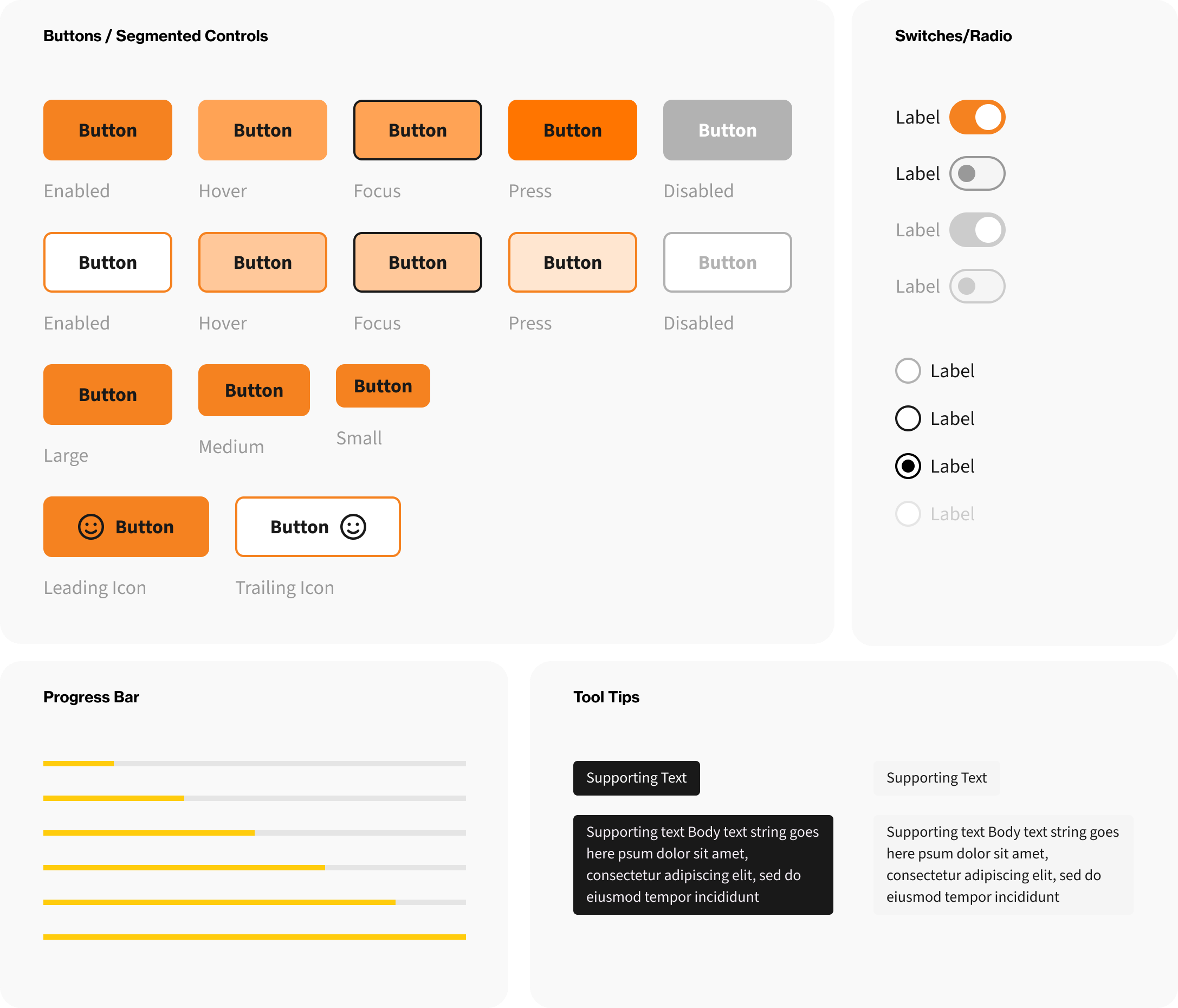
Design System Focus
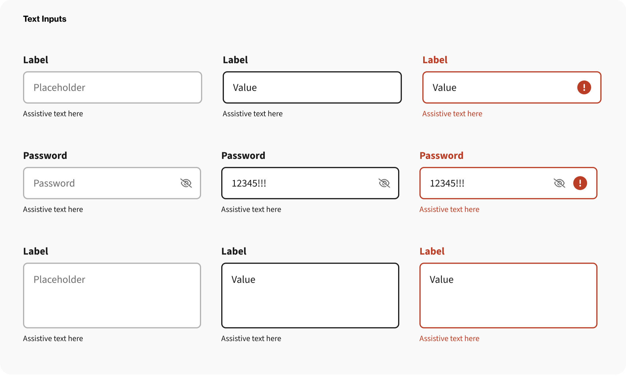
The design system was extended incrementally to support new flows and content modules, emphasizing reuse, accessibility, and consistency across web and mobile while evolving alongside the product.
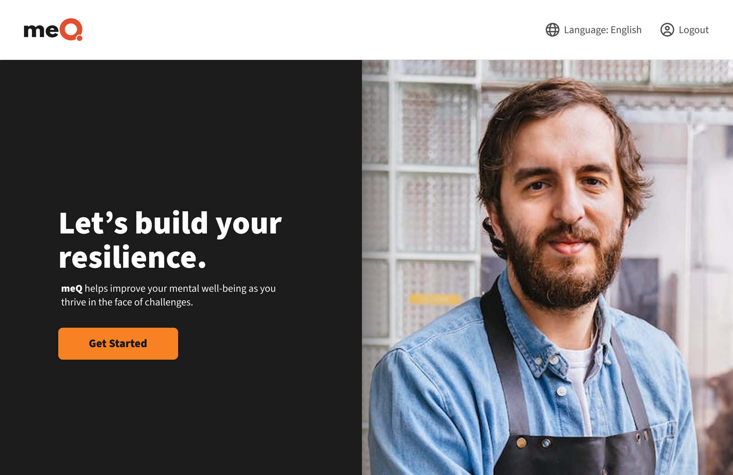
Logo
The existing logo was standardized in accordance with updated meQ brand guidelines to ensure consistent usage, scalability, and legibility across web and native mobile interfaces.

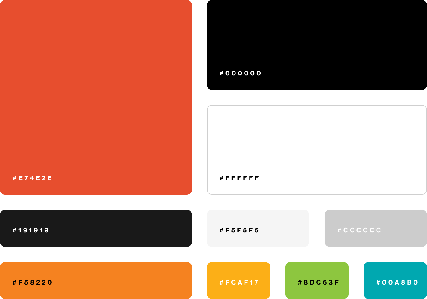
Colors
The color palette was consolidated under updated meQ brand guidelines to improve consistency, accessibility, and visual hierarchy across UI surfaces, with colors applied intentionally for emphasis and system states.
Typography
The type ramp was consolidated from a pairing to a multi-weight, 12 style single typeface, Source Sans 3, improving consistency, readability, and visual cohesion across the interface.

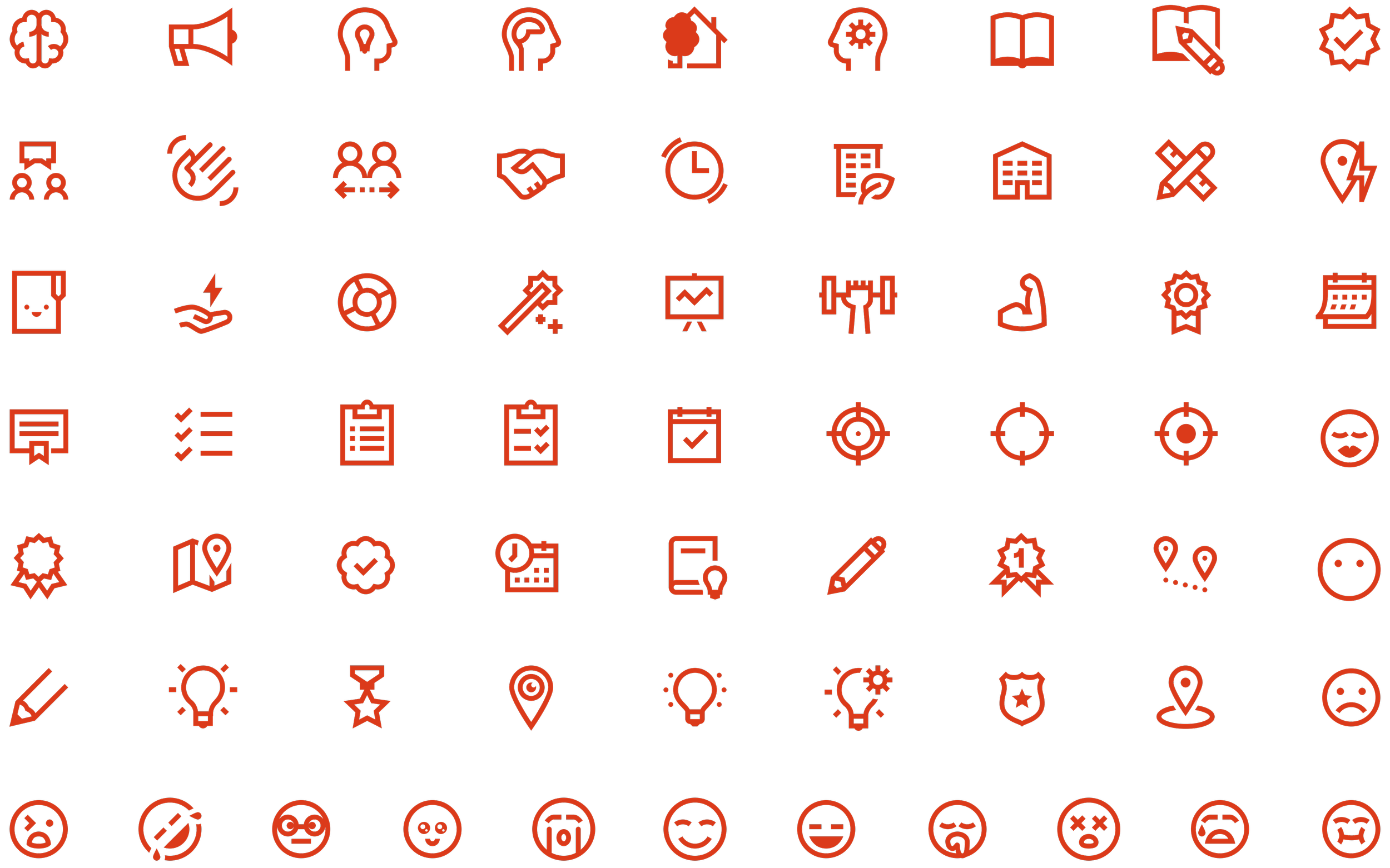
Iconography
Iconography was unified to a single, minimal style aligned with meQ brand guidelines, improving consistency, clarity, and usability across navigation, content, and action states. The extensive icon set supported a wide range of learning content and use cases while maintaining a cohesive, minimal visual language across the platform.
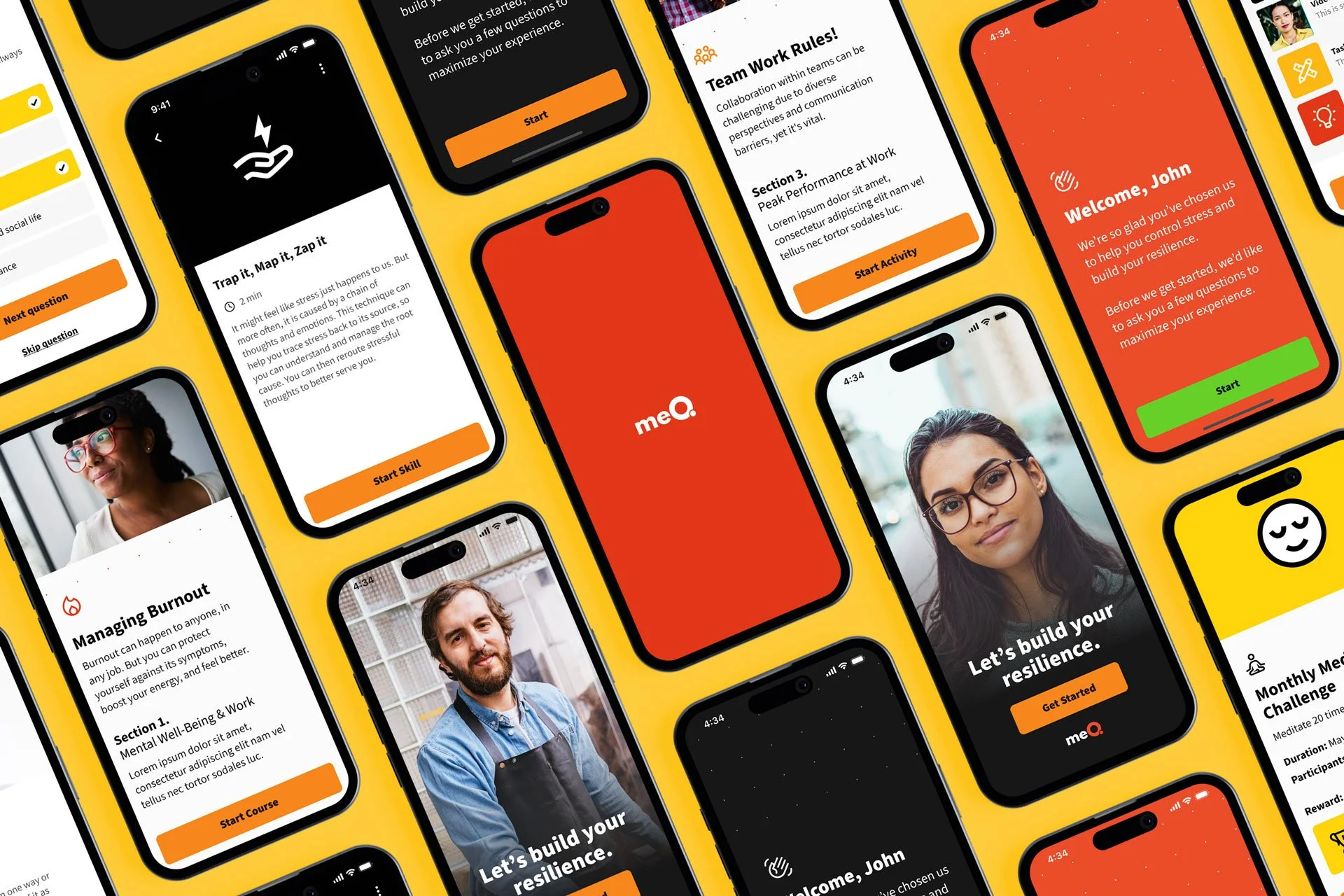
Native + Responsive Web App Experience
The solution leveraged a responsive web architecture alongside a native mobile app experience to ensure consistent behavior across devices, streamline development, and maintain a unified user experience across platforms.


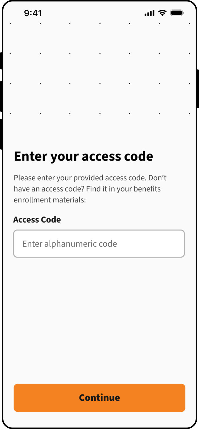
Signup, Onboarding & Assessment
The meQ signup + onboarding flow guides users from initial entry through registration or login, followed by structured onboarding and a personalized assessment experience. Multiple registration paths (SSO, verified, and multi-access) support enterprise access needs, while save-state and fallback actions reduce drop-off. Upon assessment completion, users are routed to a personalized dashboard where results inform tailored skills, activities, and the broader meQ journey.

Login & Registration
A user-centric login, registration, and onboarding approach, guarantees a seamless user experience. This simplified process enables users to access the app, create accounts, and set up profiles effortlessly.


Assessment Survey
Onboarding includes an initial assessment survey for new users. Upon survey completion, the results provide a pin-pointed personality profile, informing recommended daily and weekly activities and skills. This profile tailors the overall meQ journey for each user.


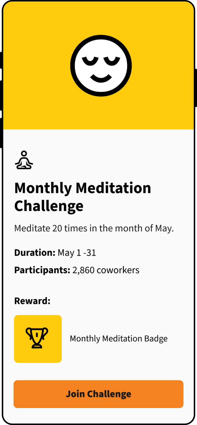
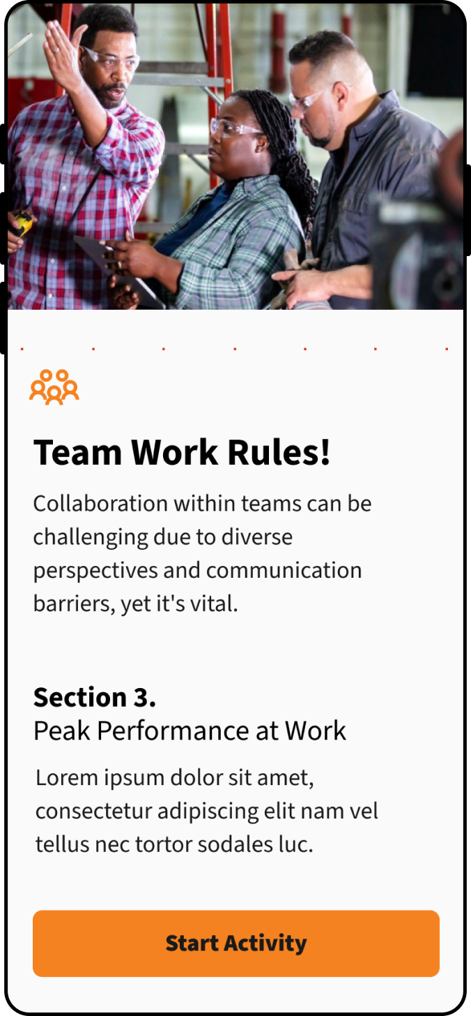
Activities & Skills
meQ’s “activity” and “skill” features are hyper-targeted (for individuals and groups) and delivered via personalization to users - aimed at identifying issues, improving mental health, fostering resilience, and reducing the risk of burnout individually and across teams and organizations.


End.
The completed deliverables were phased & prepped for hand-off to the Development Team for build-out and for use in phased usability testing, which was the next stage of the project.