
CarGurus®
CarGurus is a consumer automotive marketplace that enables users to search, evaluate, and connect with dealers for new and used vehicles. The product supports high-consideration decision-making through search, browse, vehicle detail, and dealer contact experiences across mobile and web.
Company
CarGurus
Role
Senior UX/UI Designer
Timeline
2022 - 2023


As a Senior UX/UI Designer, I worked across both current-state product improvements and future-focused native app exploration, contributing to UX strategy and UI design for login, registration, onboarding, and search experiences. I partnered closely with product and engineering to iterate on live flows while simultaneously exploring how core interactions could evolve within a native mobile context. My role emphasized translating complex, data-heavy requirements into clear, scalable design patterns that balanced immediate usability with long-term platform direction.
My Role.
Deliverables
Hi-Fidelity Mockups
Interactive Prototypes
Design System Components
Design Tools
Figma
Adobe CC
Productivity Tools
Jira
Miro
Slack
-
![]()
Role & Collaboration
Senior UX/UI Designer contributing to both current-state UX/UI improvements and future native mobile app exploration, in close collaboration with product and engineering.
-
![]()
Problem
The challenge was improving usability in a data-heavy search experience while exploring how core flows could evolve within a native mobile app.
-
![]()
Approach
Work was informed by interface audits, heuristic evaluation, and competitive/comparative analysis of automotive marketplace patterns, with parallel exploration of optimized and future-state flows.
-
![]()
Solution & Outcome
The work improved clarity and usability in live experiences while establishing a cohesive design direction for future native mobile development.


Process


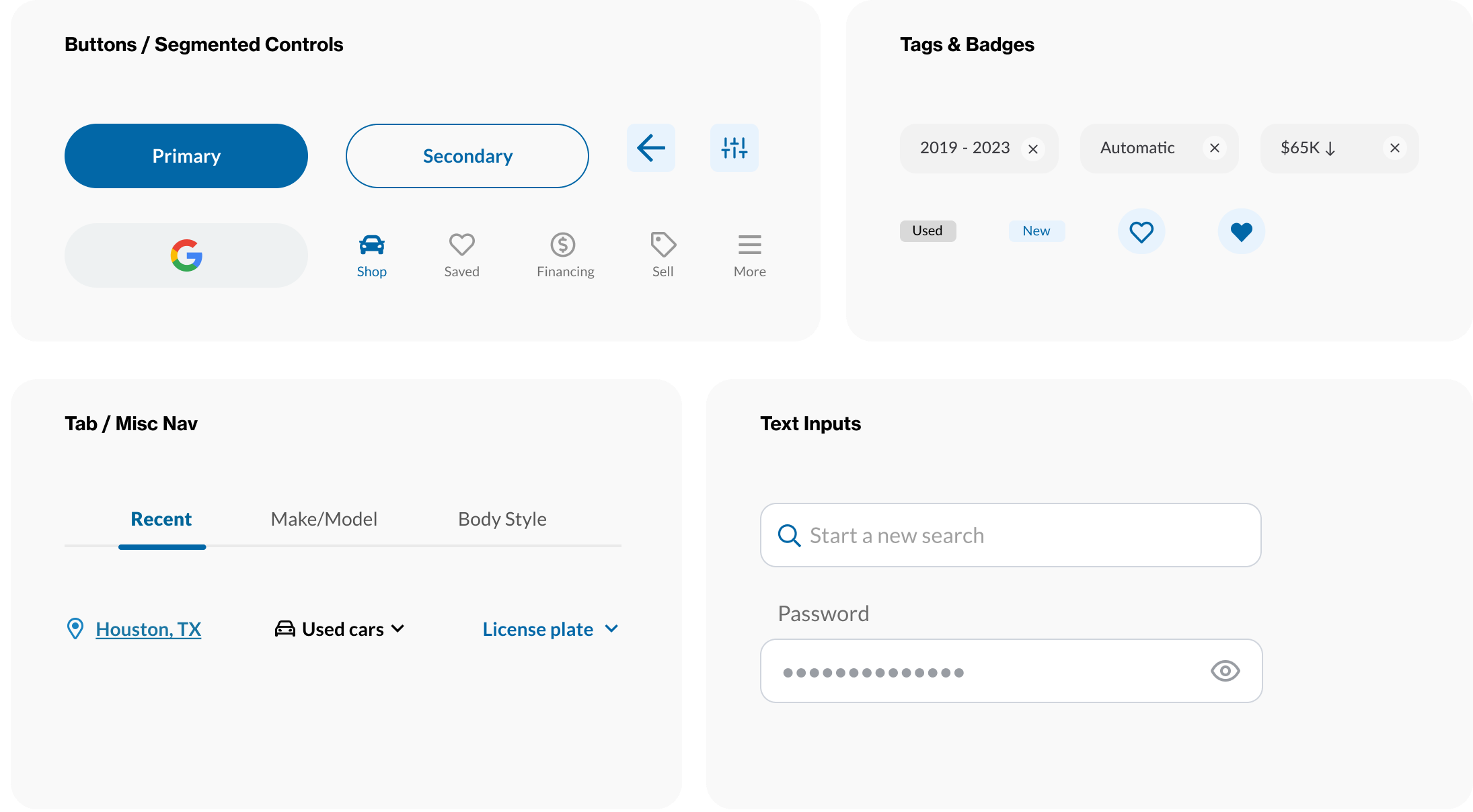
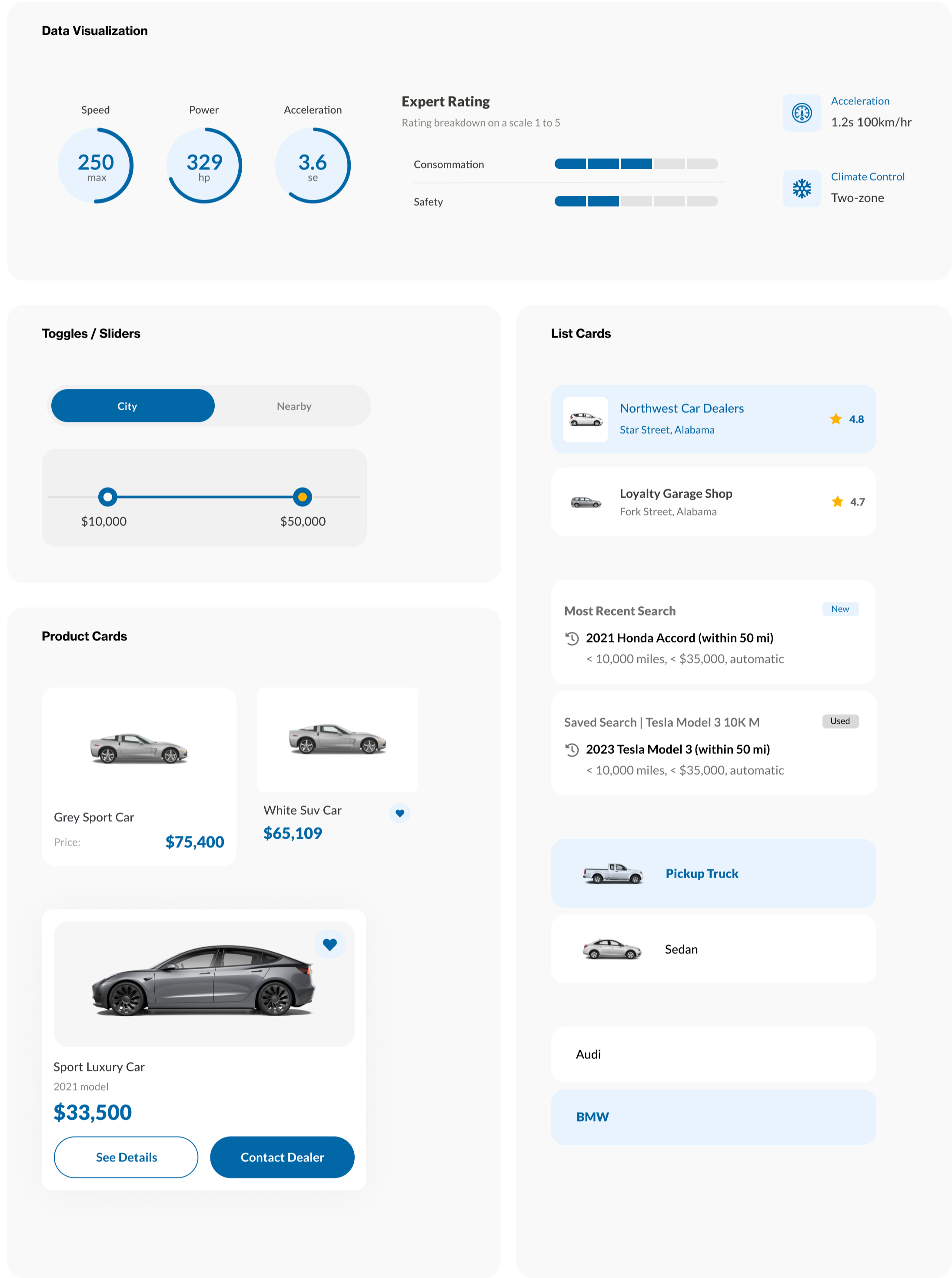
Design System Focus
Existing components were refined and reused across current-state improvements and native app concepts, with new components introduced where needed and aligned to CarGurus branding. Components were iteratively updated throughout the experience to improve consistency, accessibility, and scalability across platforms.
Colors
The thoughtful inclusion of a color scheme established a consistent and visually appealing palette throughout the interface, enhancing the aesthetic and user experience.

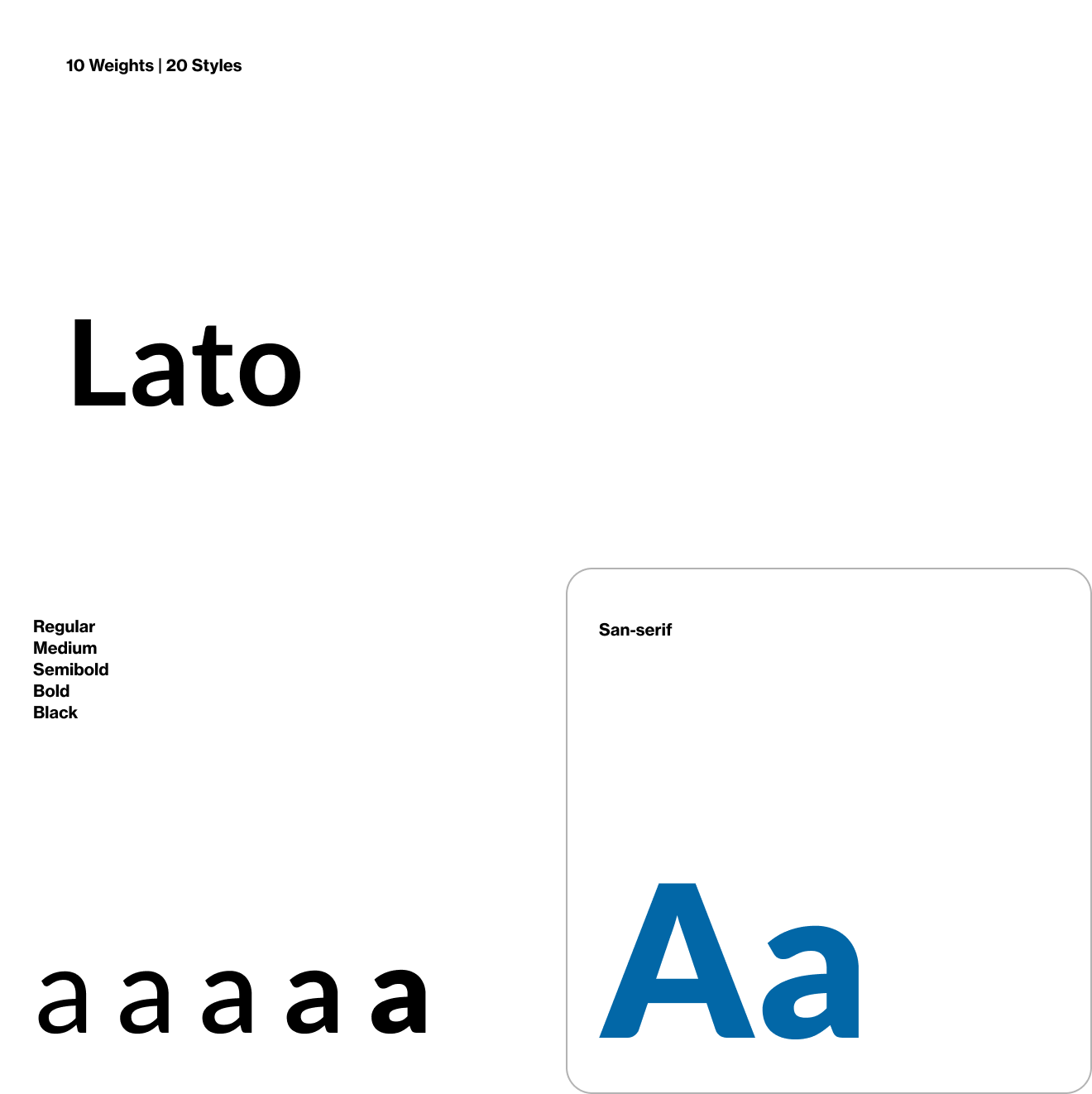
Typography
Incorporating a well-defined typography guarantees a consistent and aesthetically pleasing text style across the entire interface, promoting readability and a polished appearance for users.
Iconography
Incorporating "Font Awesome" for consistent icon usage ensured efficiency, user understanding, uniformity, and streamlined design/updates for the UI & Development team.

Signup & Registration
Users move from login or registration into the home experience, where typeahead and browse search serve as primary entry points for vehicle discovery.

Signup, Login & Onboarding
A user-friendly login, registration, and onboarding process, ensuring a smooth user experience. This straightforward approach allowed users to easily access the app, create accounts, and set up profiles. It streamlined user engagement, simplified data management, and maintained an efficient and intuitive onboarding process.


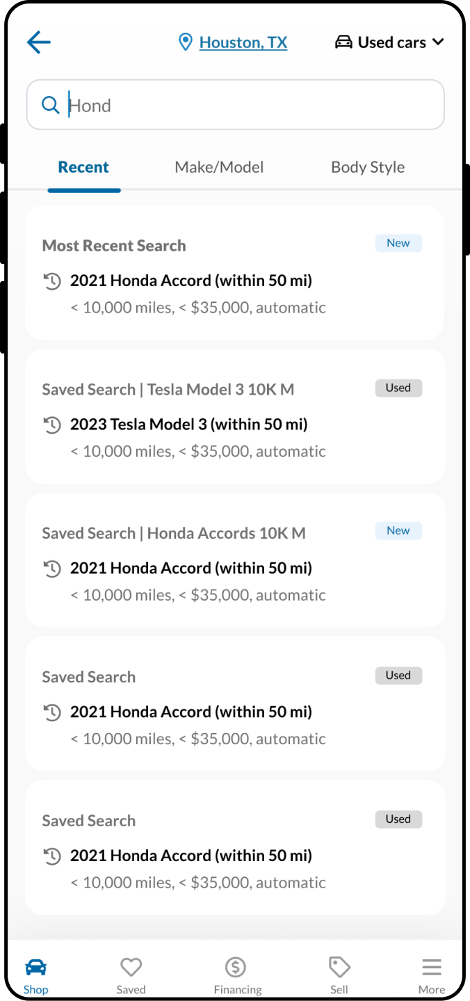
Search Userstory
“As a user of the CarGurus native mobile app, I want to have the option to choose between type-ahead search and browse search functionalities to improve my search experience, enabling me to find the perfect car listings with ease at the location of my choice.”
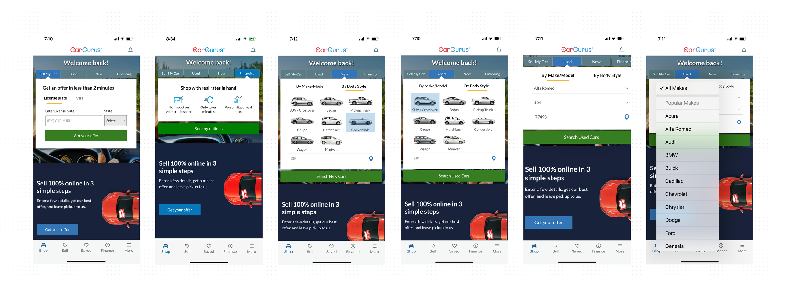
Current-state Browse-only Search
Current-state familiar Browse-only search functionality that users are accustomed to. UI is dated vs. Dev React Native Design System and also rigid/clunky visually.
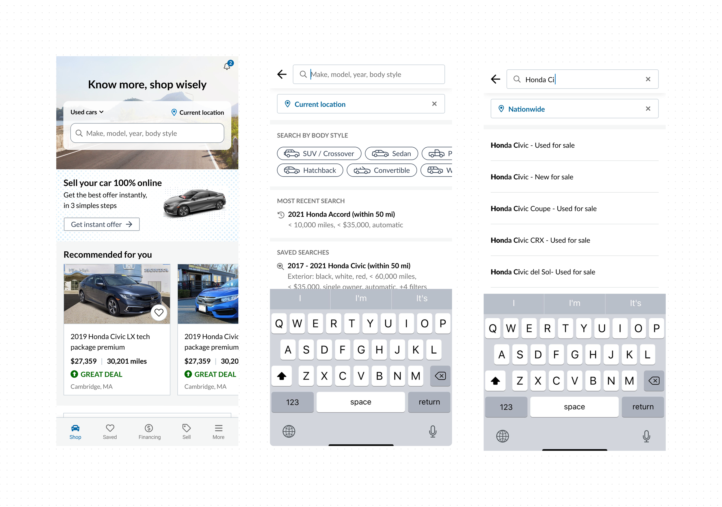
Test-state Typeahead-only Search
The user feedback received indicated dissatisfaction with the new type-ahead-only search feature, highlighting specific pain points and usability issues.
Pain-points identified
Recent live test implementation of a new Typeahead-only search feature in the CarGurus native app resulted in negative user feedback and 3.5% drop in conversion rate.


To address the challenge of replacing the browse search functionality with type-ahead search in the CarGurus native mobile app, a solution is proposed. Create a combined type-ahead + browse search approach, offering users the choice between the two options ensuring a comprehensive and flexible search experience.
Design an intuitive interface with a prominent search bar supporting real-time type-ahead suggestions.
Integrate a browse option within the search interface, allowing users to explore categories alongside type-ahead.
Implement smart search suggestions based on user input and behavior.
Design supporting screens in addition to the home screen as needed for location and tabbed browsing.
Remove and separate “Sell My Car” and “Finance” tabs from Browse search.
1. Competitive Research (Carmax)
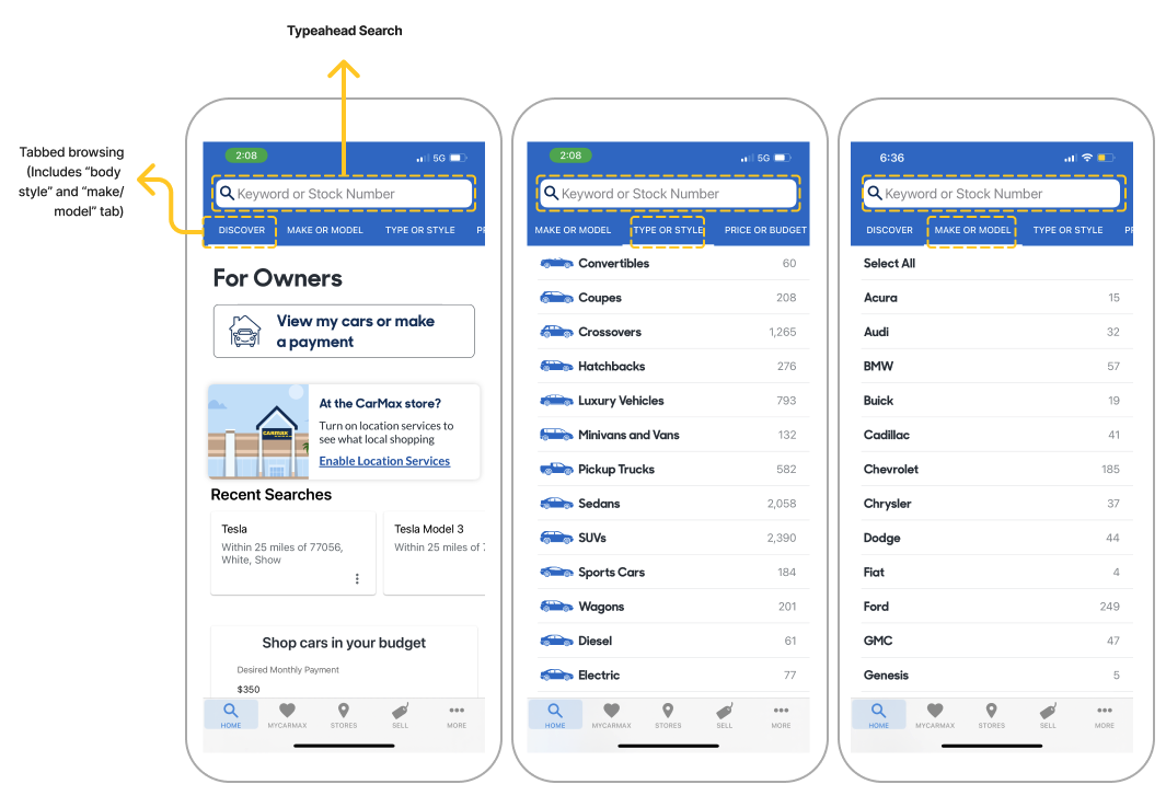
Typeahead/Browse Search Combo
During our competitive research, we discovered that the Carmax native app utilizes a combined typeahead search and tabbed browsing UI, which could inspire our goals of improving the home screen of our CarGurus app. Drawing inspiration from Carmax's UI and functionality, we can leverage their successful approach as a starting point for enhancing our own app's user experience.
To meet the project's timeline and leverage the existing design system components and styles, the preferred approach was to work directly from a high-fidelity level. The main focus was on designing a typeahead + browse search component option that aligned with the capabilities of the existing native app platform (React Native), the current Cargurus brand, and the familiar UX/UI that users were accustomed to.
Additionally, supporting screens and improvements to location functionality were considered/iterated.
The goal was to deliver an improved and intuitive search experience within the constraints of the project's requirements and resources.
2. Hi-fidelity Iterative Mockups
Combo Typeahead + Browse Search Component Iterations

Component Iteration 01

Component Iteration 02

Component Iteration 03

Component Iteration 04
The integration of typeahead and browse search features in our car buying and selling app greatly enhanced the user experience. It provided users with the flexibility to either quickly find specific listings by typing in keywords or explore a broader range of options through category-based browsing. This dual approach catered to both targeted and exploratory user needs. It streamlined the search process, simplified listing discovery, and ensured a versatile and user-friendly experience, accommodating a wide range of user preferences.
Typeahead + Browse Search Combo


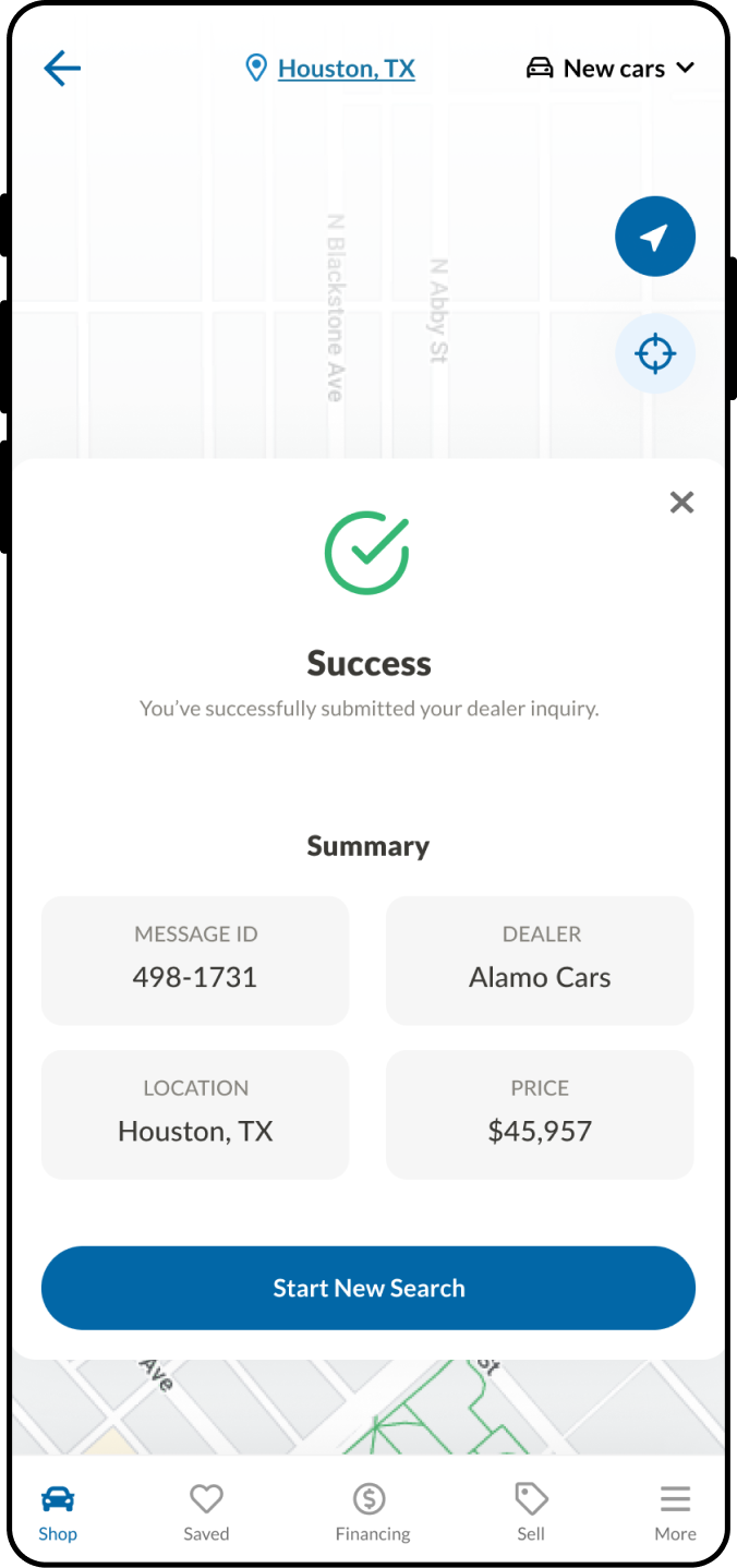
Dealer Contact
A user-friendly login, registration, and onboarding process, ensuring a smooth user experience. This straightforward approach allowed users to easily access the app, create accounts, and set up profiles. It streamlined user engagement, simplified data management, and maintained an efficient and intuitive onboarding process.

End.
The completed deliverables (specifically the interactive prototypes) were prepped for use in upcoming user and usability testing, which was the next phase in the project.